Client: Aparna-Craft

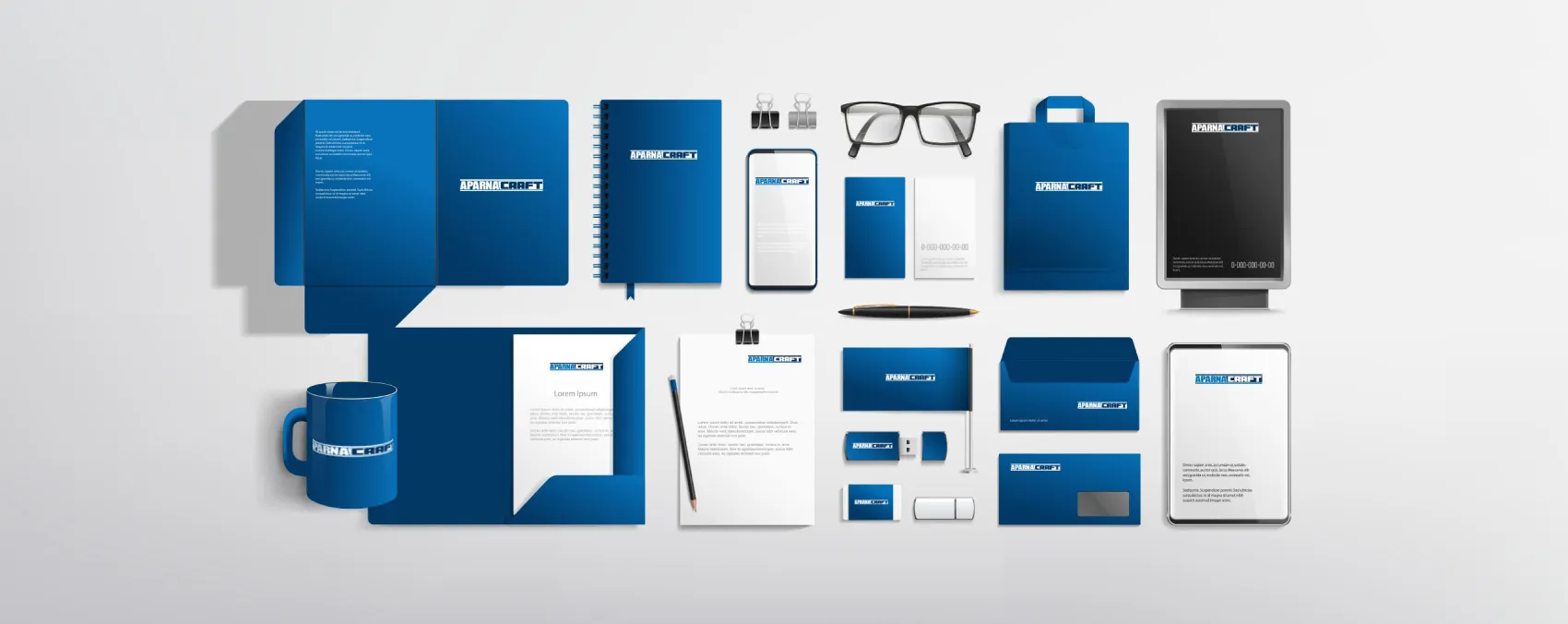
Brand Identity | Logo Design | Stationary

In a nutshell

Design brand identity for APARNA-CRAFT - a partnership between two industry leaders: Aparna Group, a renowned construction and building materials company based in India, and Craft Holdings, a global leader in façade and exterior design engineering based in Hong Kong. The collaboration aims to bring top-quality façades and exteriors to the Indian shores.

Create a new identity by retaining the identity of the two leaders

Aparna Enterprises is a highly respected brand in the building materials industry. Its blue square logo has become a symbol of reliability. The same is true for Craft's logo, which was originally designed by its founder, Craft. Both brands wish to retain their original identities so that they are immediately recognizable in the market.

Join them intelligently

Sometimes “don’t fix that ain’t broken” philosophy works well. We just have to join them with a gluey strategy.

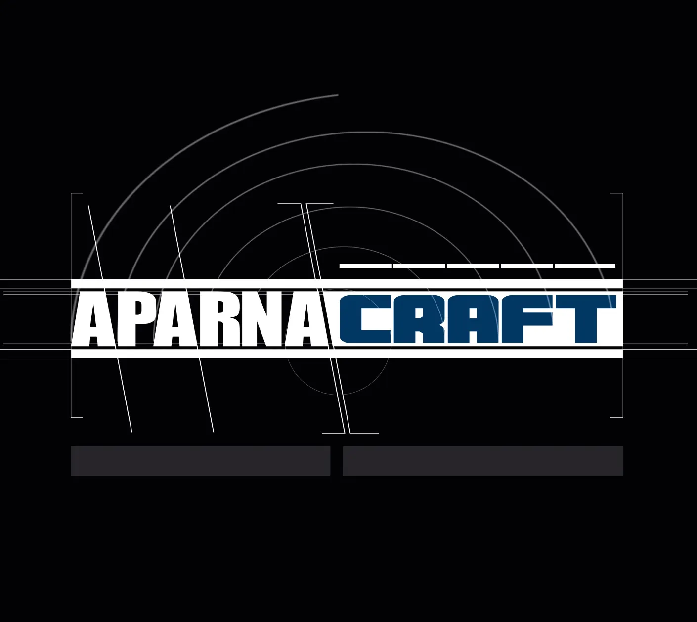
We discussed with Craft and Aparna that we would like to make the logo more digital-friendly by focusing only on the letters and avoiding any icons or mnemonics.

AH created a positioning strategy for Aparna-Craft: bringing to market a proposition that will help drive rapid innovation, bring new technologies, and deliver increased customer value. Aparna-Craft will enable architects and building owners to accelerate and truly realize their vision of transforming Indian skyscrapers.

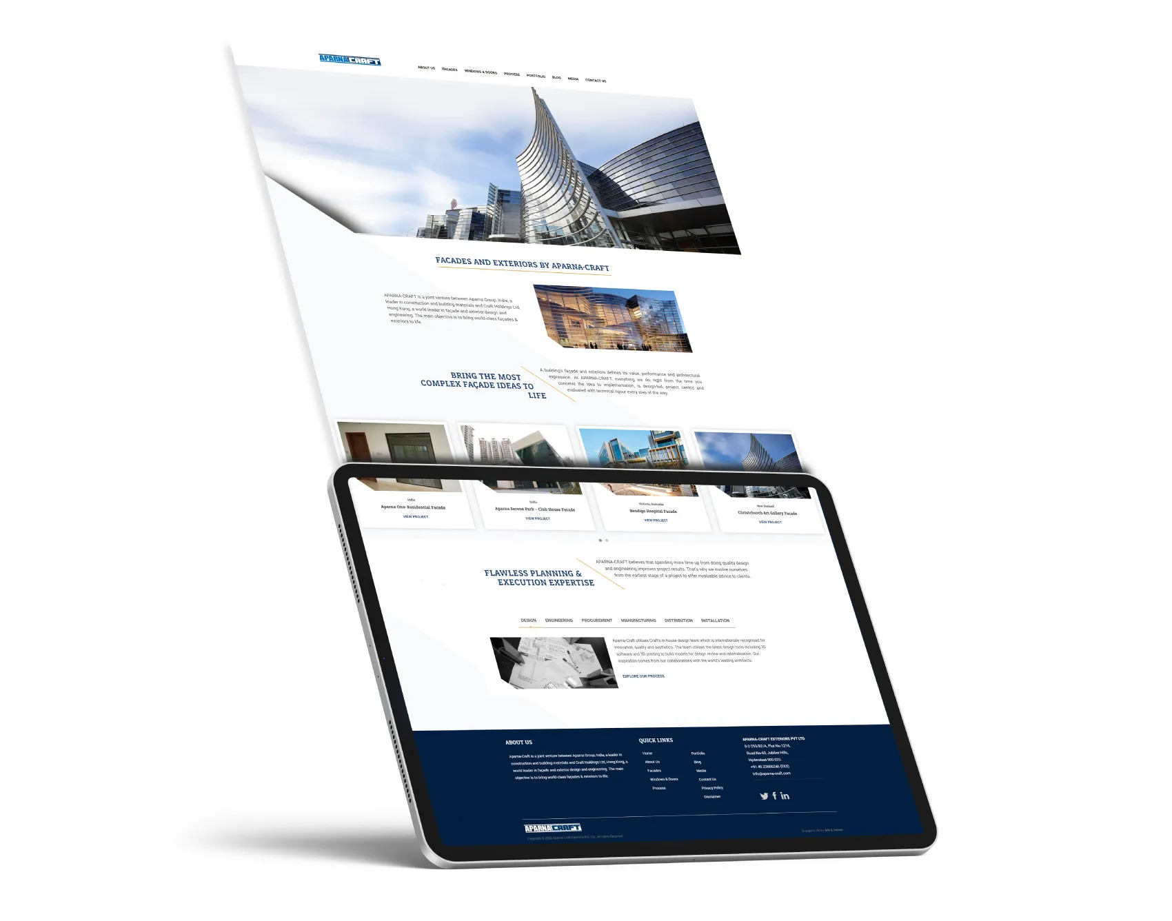
To represent this identity, we chose elements like sliding lines and slanted yellow lines on digital mediums, which hint at the transformative designs in facades. These elements are used across all print and website materials. The slanted element is also used in the logo construction to balance the brand intelligently.

The Aparna-Craft logo has been created by combining the word Aparna from its corporate logo with the Craft logo, which includes two parallel lines above the word "Craft." To retain the identities of both brands, we have maintained their respective brand colors in the balanced logo.”

"The idea by AH to create a logo that maintains the heritage of the original logos while also being innovative is very clever. Their design for combining the two logos is both creative and seamless. They have worked closely with our Hong Kong partner, carefully considering their brand and needs, as well as how they want to be represented in the Indian market.."

Aparna Reddy Director, Aparna Enterprises